After brainstorming some ideas for my zine in my sketchbook. I decided to start to develop my ideas for my front cover. I decided on a circular boarder decorated with flowers and plants because it suggests growth and comfort which I am trying to portray in my zine as the audience I am aiming for is woman would are debating having an abortion and need some reassurance as well as guidance when making the decision.
I used the software pro create to digitally design and paint all of these outcomes as it is something that I have been trying on my recently and would like to continue to use and further my knowledge and skills on it. The typography and text was all created in photoshop. I think next time I should find some fonts to download as photoshop only has a limited amount of fonts and I tend to use the same ones all the time.
I experimented with different colour palettes such as black and white, light grey and dark grey as well as light grey and light pink. I liked the pink and grey combination as it gave off an approachable feel, however the order did not feel visually interesting so I swapped it around for a grey background and pink outlines which I found to be a higher quality outcome compared to the previous format. I decided that it would also be the back page design and it would have a nice balance when created into a zine.


I wanted to include a poem into my zine as they are based on people’s experiences but also has a calming tone when reading them. I found it a little difficult to find a pro choice / pro abortion poem as it’s a very controversial subject and there was more poem which were against it.
I wanted to keep the colour palette the same throughout so it would have some consistency and look like it was part of the same zine. Having a grey background with a pink coloured poem on the page, looked extremely boring therefore I decided to digitally paint a rose as it linked back to my front page but also gave the page a bit more visuals.
The text isn’t as easy to read because it is a small size so this would be something I need to think about next time, maybe spreading it out between two pages or find a shorter poem. Also the rose needs to have a selective colour palette as it varies through different petals and looks messy.


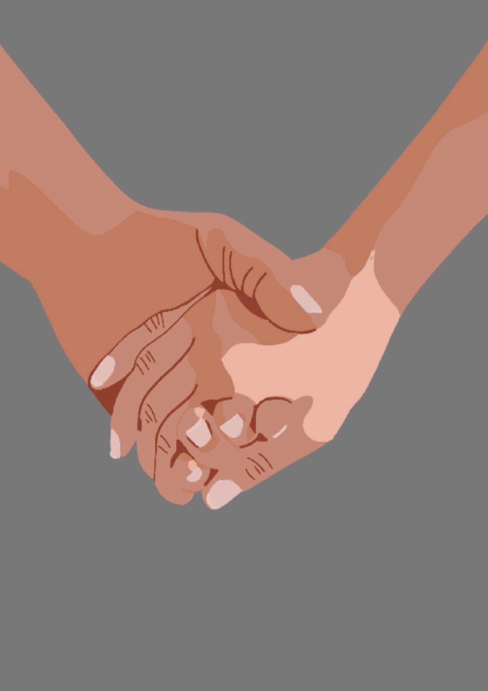
The next page is another digital drawing of two hands holding to symbol togetherness. Its a sign of support which is what a woman would need at that particular time. I think it is a good idea to include single imagery pages as it wont be overloaded with text. I really like creating this piece as it allowed me to consider the highlights, mid tones and shadows to create a final image. I need to continue to use this technique is further painting to get a better quality image. I need to keep in mind the page orientation as the image I followed was landscape when it was suppose to be portrait therefore I had to squish the final image to make it fit.
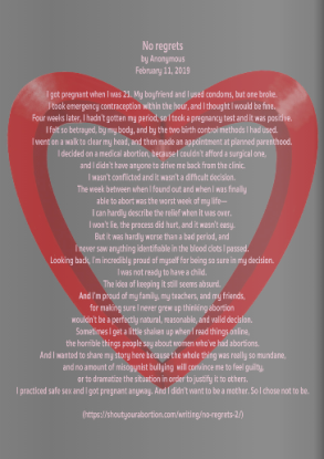
The following page consists of a personal story which I found on https://shoutyourabortion.com/#the-movement and I included it because it shows somebodies personal experience with having an abortion. I needed to plan the painting as it was just an experiment and it doesn’t look 3D which was what I was trying to get across. I think it is an area I need to explore more, especially the highlights and shadows as these lack in quality. I think as well the text needs to be at a bigger, more readable size as this isn’t as easy to read. I need to think about what type of technology people would be reading this on because if it was on a mobile phone they wouldn’t be able to read any of it.

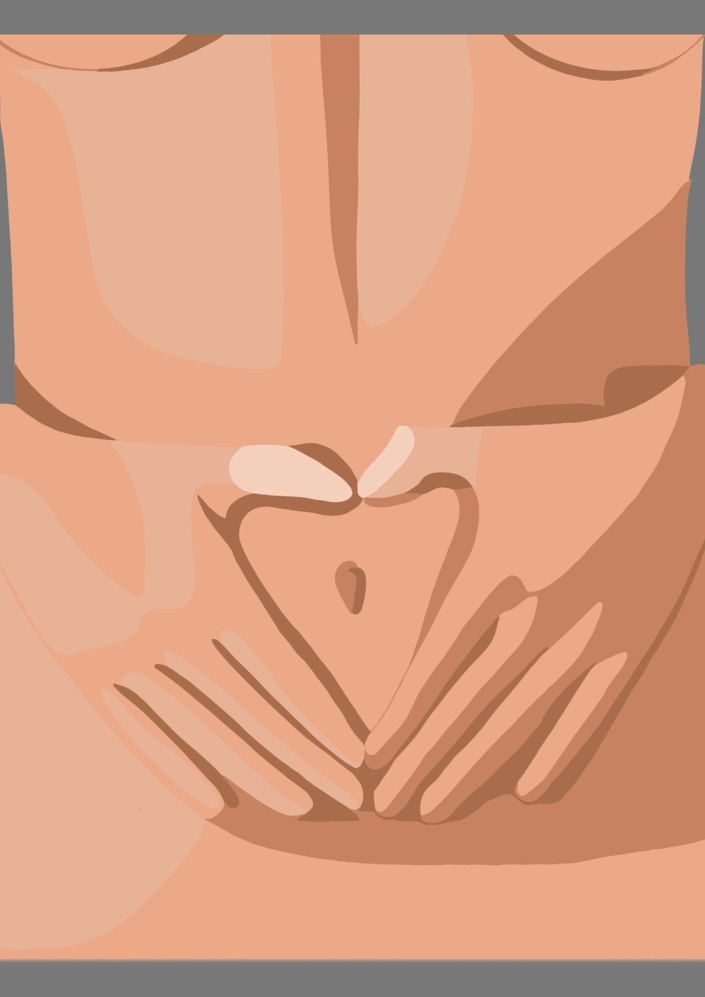
Using the quote ‘ my body, my choice.’ as the next pages context, to me worked really well. I don’t really work / draw with the human body so I liked exploring it through digital softwares. It also gave me a chance to explore highlights and shadows to create a more interesting piece that just having an outline. It is however very pixelated which I would need to improve next time, I think it is due to the blending of the shades. But again, this is something I would need to explore further and build up my confidence on. As I created the piece onto a white background instead of the grey one so when I transferred it onto the grey background there was a white outline. I did try and edit it out but it didn’t work as well. I used an inner glow but it wasn’t as successful as I wanted it to be.
I briefly experimented with the typography, having the text interact with the drawing looks and feel more comfortable than the text being placed onto of the piece. I also added an outer glow to the text as it made it stand out more, although it isn’t as strong on ‘choice’ as it blends in with the image. I would need to explore this more if it was to do it in further projects.


The next page is another personal story. Again I need to think about the size of the text as it hard to read or put a drop shadow behind to make it stand out against the background. The imager which I included was a pregnancy test with the sign as a question mark, symbolising the unknown. I liked the idea of this however it could have been executed a lot better, for one the style is very cartoony which doesn’t go with the previous illustrations. I could have added in more tonal elements but also the colour palette. I used blue as the end colour where as all the other colours have been pinks, reds and other warm colours. I need to make sure that there is a constant style throughout my zine next time. Another thing would be the line, this could have been more precise and accurate as it look rushed and messy. Maybe next time I won’t add the black outline as none of the other images have this. 
The final image is my favourite out of all of the illustrations, I think this is because I done it last and I learnt from my past mistakes and applied the corrections to this piece. Instead of starting with an outline, I went straight into the highlights, following the highlights from the photograph. I tried to keep the colour palette to a minimum by selecting only four colours. This piece is still cartoonish however it has a lot more depth in it and shows that I have really thought about how I want the final outcome to look like.